Code: Alles auswählen
#!/usr/bin/env python
# -*- coding: iso-8859-15 -*-
import wx
import wx.lib.plot as plot
wx.SetDefaultPyEncoding("iso-8859-15")
class MyFrame(wx.Frame):
def __init__(
self, parent = None, id = -1, title = "Example", size = wx.Size(500, 500)
):
wx.Frame.__init__(self, parent, id, title, size = size)
panel = wx.Panel(self)
vbox_main = wx.BoxSizer(wx.VERTICAL)
panel.SetSizer(vbox_main)
vbox = wx.BoxSizer(wx.VERTICAL)
vbox_main.Add(vbox, 1, wx.ALL | wx.EXPAND, 5)
#----------------------------------------------------------------------
#
# Beispiel: Horizontale Balken
#
#----------------------------------------------------------------------
hor_canvas = plot.PlotCanvas(panel)
vbox.Add(hor_canvas, 1, wx.EXPAND | wx.ALL, 5)
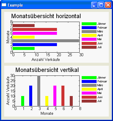
hor_lines = (
plot.PolyLine(((0, 1), (10, 1)), colour = "green", legend = u" Jänner", width = 10),
plot.PolyLine(((0, 2), (20, 2)), colour = "blue", legend = u" Februar", width = 10),
plot.PolyLine(((0, 3), (30, 3)), colour = "gray", legend = u" März", width = 10),
plot.PolyLine(((0, 4), (10, 4)), colour = "yellow", legend = u" April", width = 10),
plot.PolyLine(((0, 5), (20, 5)), colour = "magenta", legend = u" Mai", width = 10),
plot.PolyLine(((0, 6), (20, 6)), colour = "orange", legend = u" Juni", width = 10),
plot.PolyLine(((0, 7), (10, 7)), colour = "brown", legend = u" Juli", width = 10),
)
hor_graphics = plot.PlotGraphics(
objects = hor_lines, title = u"Monatsübersicht horizontal", xLabel = u"Anzahl Verkäufe",
yLabel = u"Monate"
)
hor_canvas.SetFont(wx.Font(10,wx.SWISS,wx.NORMAL,wx.NORMAL))
hor_canvas.SetFontSizeAxis(10)
hor_canvas.SetFontSizeLegend(7)
hor_canvas.SetEnableLegend(True)
hor_canvas.SetXSpec('auto')
hor_canvas.SetYSpec('auto')
hor_canvas.Draw(hor_graphics, yAxis = (0, 8))
#----------------------------------------------------------------------
#
# Beispiel: Vertikale Balken
#
#----------------------------------------------------------------------
vert_canvas = plot.PlotCanvas(panel)
vbox.Add(vert_canvas, 1, wx.EXPAND | wx.ALL, 5)
vert_lines = (
plot.PolyLine(((1, 0), (1, 10)), colour = "green", legend = u" Jänner", width = 10),
plot.PolyLine(((2, 0), (2, 20)), colour = "blue", legend = u" Februar", width = 10),
plot.PolyLine(((3, 0), (3, 30)), colour = "gray", legend = u" März", width = 10),
plot.PolyLine(((4, 0), (4, 10)), colour = "yellow", legend = u" April", width = 10),
plot.PolyLine(((5, 0), (5, 20)), colour = "magenta", legend = u" Mai", width = 10),
plot.PolyLine(((6, 0), (6, 20)), colour = "orange", legend = u" Juni", width = 10),
plot.PolyLine(((7, 0), (7, 10)), colour = "brown", legend = u" Juli", width = 10),
)
vert_graphics = plot.PlotGraphics(
objects = vert_lines, title = u"Monatsübersicht vertikal", xLabel = u"Monate",
yLabel = u"Anzahl Verkäufe"
)
vert_canvas.SetFont(wx.Font(10,wx.SWISS,wx.NORMAL,wx.NORMAL))
vert_canvas.SetFontSizeAxis(10)
vert_canvas.SetFontSizeLegend(7)
vert_canvas.SetEnableLegend(True)
vert_canvas.SetXSpec('auto')
vert_canvas.SetYSpec('auto')
vert_canvas.Draw(vert_graphics, xAxis = (0, 8))
def main():
"""Testing"""
app = wx.PySimpleApp()
f = MyFrame()
f.Center()
f.Show()
app.MainLoop()
if __name__ == "__main__":
main()Gerold
Stichworte: Diagramm Graph Balken Balkendiagramm